Apple Unveils “Liquid Glass” Design Language at WWDC 2025
At WWDC 2025, Apple introduced its latest user interface concept, dubbed “Liquid Glass.” This innovative design philosophy is set to infuse greater transparency across various Apple devices, including iPhones, iPads, Macs, and Watches. The new aesthetic might either delight users or create frustrations, heavily depending on individual visual preferences and sensitivity to light.

This new interface doesn’t signify a complete redesign but rather an evolution of existing trends in Apple’s UI. Many users may have noticed a gradual incorporation of glass-like transparency over recent years, and it appears this feature will be front and center in the upcoming versions.

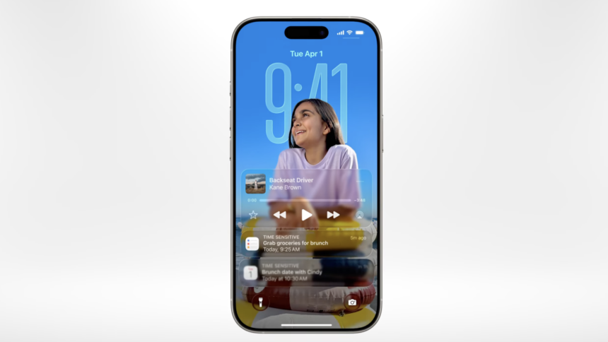
During the keynote, various images illustrated how colors seamlessly blend through UI elements, from pop-up menus to the address bar in Safari.

It is reported that “Glass” will function as one of three UI modes, in addition to the familiar light and dark themes. However, the exact relationship between these options remains unclear. Users will also gain more ways to personalize their experience, including the ability to modify icon and widget color schemes, further expanding on previous customizations introduced last year. The new visuals aim to declutter home screens and potentially minimize impulsive icon tapping.

The degree of personalization available is impressive. Enthusiasts of transparency are likely to appreciate this feature, while those who are less fond will benefit from alternative modes.
These advancements are being facilitated by Apple’s latest powerful processors, which can effortlessly handle such effects. Users with older devices may start to notice a decline in performance, making it essential for the option to disable transparency to remain accessible, particularly for individuals with visual impairments.