Discover Google’s New Material 3 Expressive Design Language
Google has announced an exciting and significant overhaul to its Material 3 design framework, which dictates the aesthetics of applications on both Android and the web. This update, termed Material 3 Expressive, aims to enhance user engagement and usability, marking a bold evolution from prior versions.
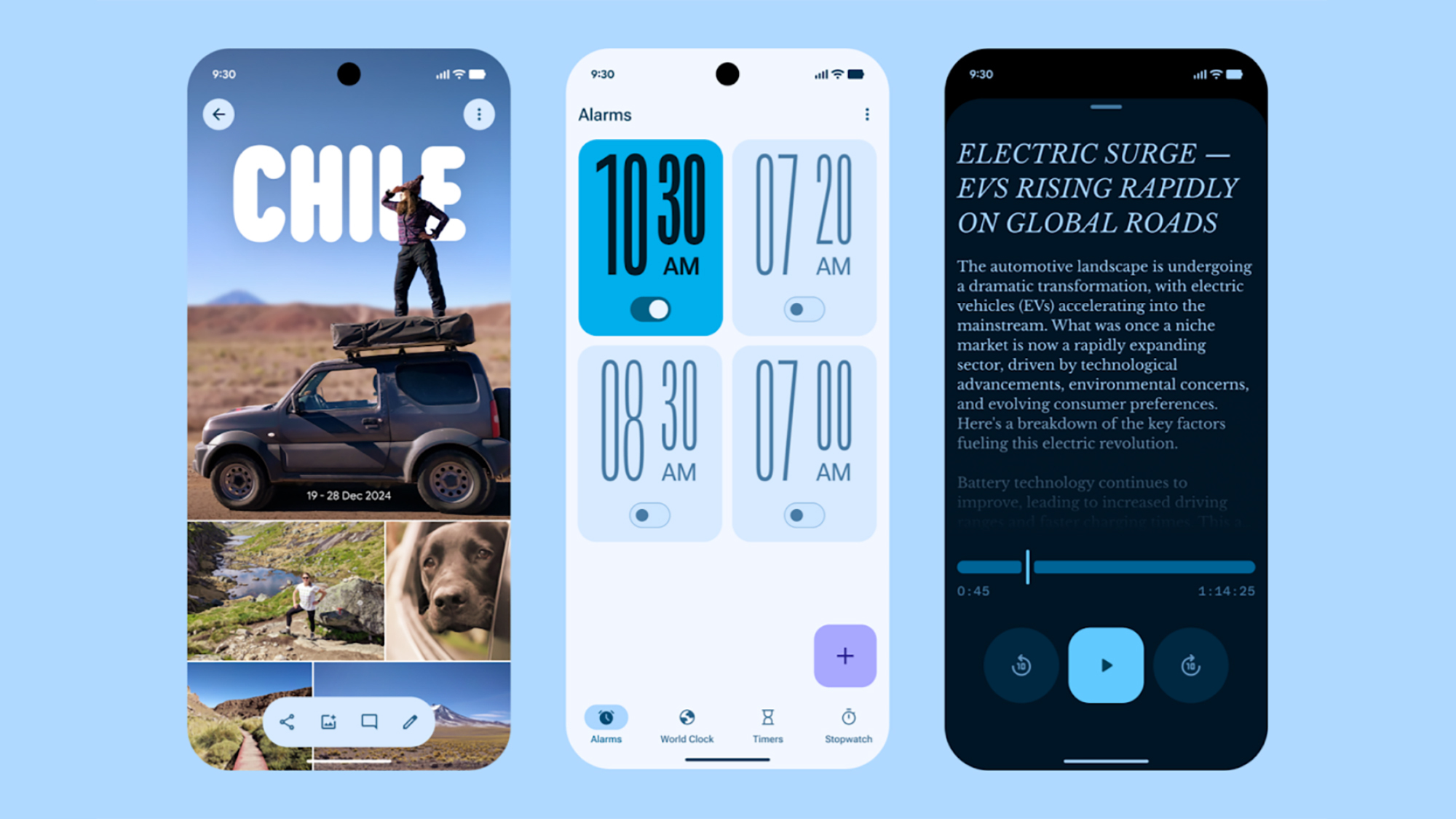
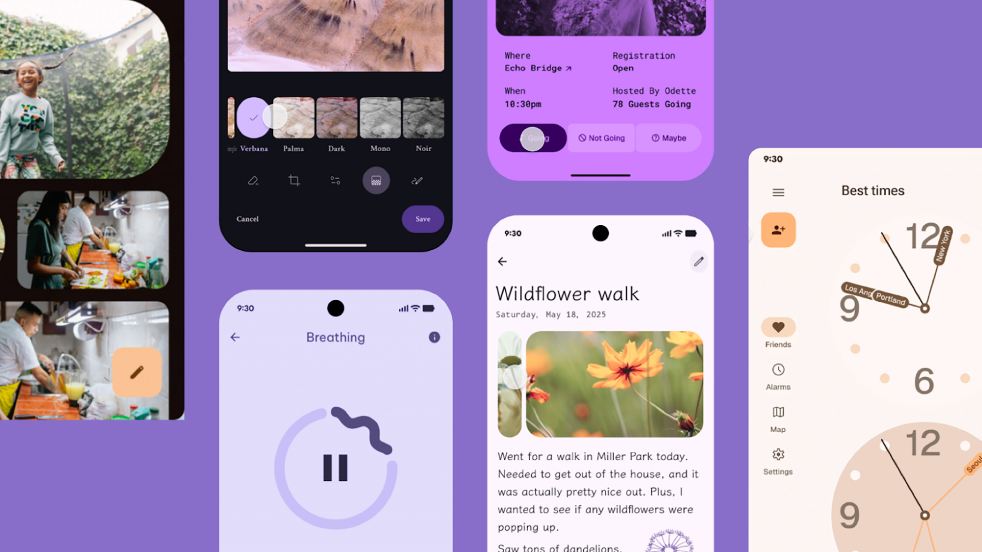
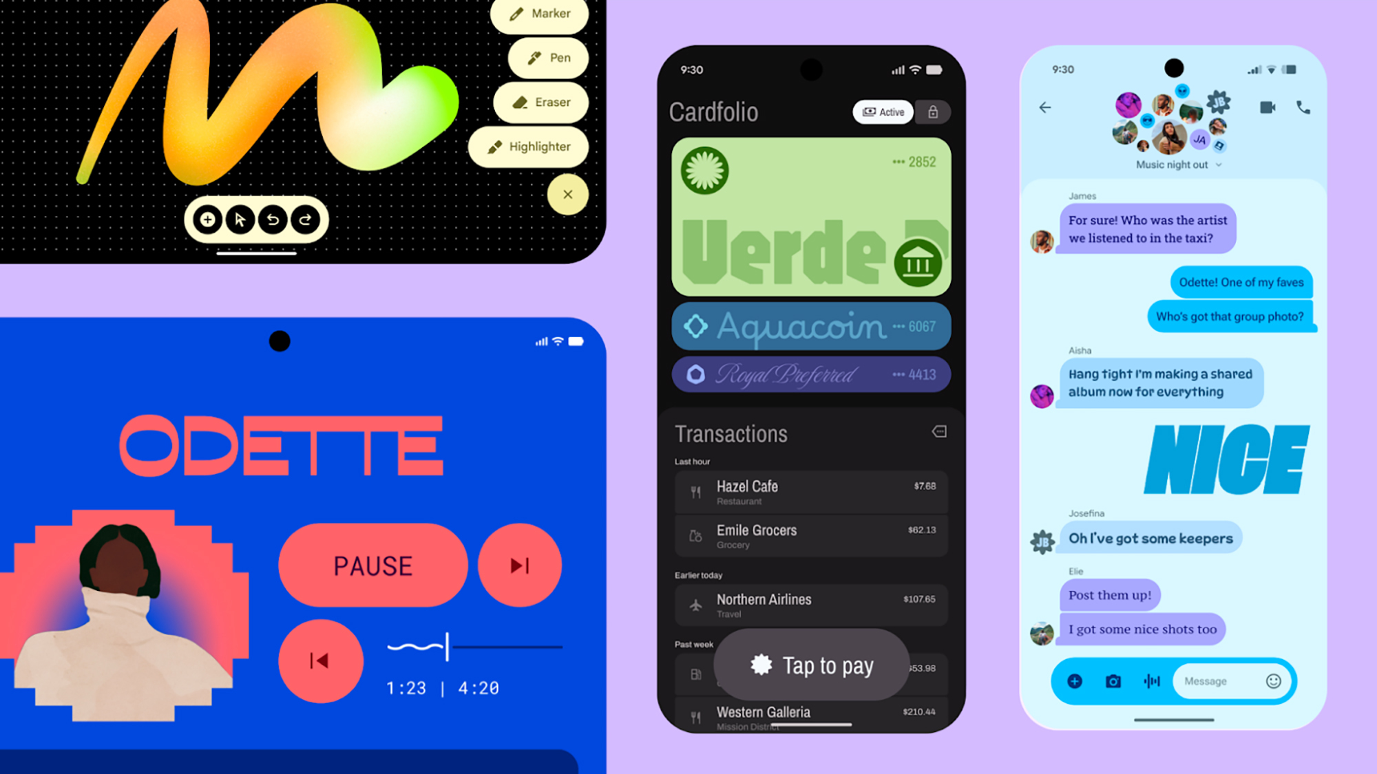
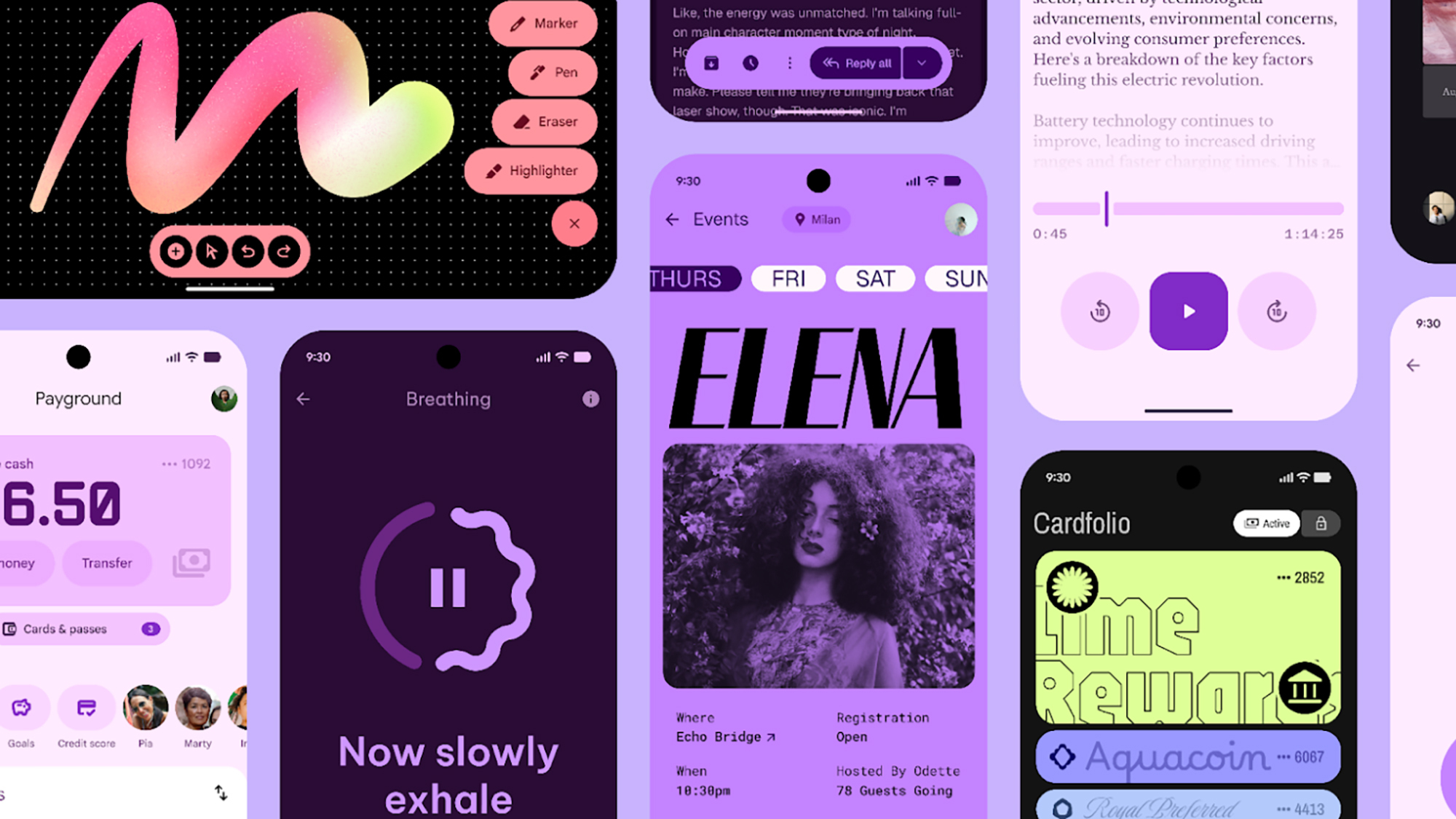
Understanding what Material 3 Expressive embodies is a bit of a challenge, yet Google’s own illustrative images provide a glimpse into this new vision. The concept revolves around design that “elicits emotion,” fostering connectivity through visuals and interactions that evoke specific moods or feelings, as highlighted in their official blog post.
Credit: Google
This transformation introduces more vivid colors, innovative typography, adaptable shapes, and smoother animations. Expect to witness Material 3 Expressive making its way into Google’s applications, and there is a push for external developers to embrace this aesthetic as well. More details are anticipated at the upcoming Google I/O 2025, scheduled for May 20.
The showcased images reveal a variety of text styles designed to enhance app features, making them visually striking. These new elements guide users’ attention to significant functions, such as an audio recorder or unread notifications. Additionally, users will see a wide array of new forms and transitions.
Credit: Google
Moreover, animation is designed to appear more lifelike and intuitive. The color palette has been significantly enriched, allowing for improved navigation within apps, thereby helping users easily locate core features.
Google is inviting developers to mix and match these colors, shapes, text styles, and animations for more imaginative designs. “Designers have unprecedented creative control with M3, so we encourage exploration of these components to discover what fits best,” states Google.
Informed by User Feedback
The comprehensive Material 3 Expressive design encapsulates various elements of a software interface, such as navigation bars, progress indicators, app controls, carousels, and floating action buttons (FABs). However, Google has emphasized that this is not a significant leap to Material 4 but rather an enhancement of the existing Material 3 design.
The impetus for Material 3 Expressive was to enhance emotional connectivity in mobile and web applications, steering away from a uniform appearance. With several guidelines in place for developers, Google also seeks diversity and innovation, including standout moments that “deviate from repetitive design patterns.”
Credit: Google
A wealth of research culminated in this refreshed aesthetic. As reported by Google, the Material 3 Expressive framework is based on 46 diverse studies involving over 18,000 participants, who evaluated visuals based on criteria like playfulness, energy, creativity, and modernity.
Through a combination of surveys, experimental methods, and eye-tracking analyses, Material 3 Expressive has been meticulously crafted over three years. The elements seen today have been refined through extensive testing and are expected to maintain relevance for years to come.
Credit: Google
The new design has garnered positive feedback across age groups. According to findings, the new design principles simplify usability, leading to applications that users prefer to adopt. Notably, key UI components are reportedly much easier to recognize in applications adhering to the Material 3 Expressive guidelines—up to four times simpler.
Regardless of individual preference for the Material 3 Expressive aesthetic, the transformation is on the horizon for Google’s array of applications across mobile and web platforms. Google has also released design toolkits for developers, facilitating third-party apps to integrate this visual upgrade in the near future.