Embracing Change: Apple’s New Liquid Glass Design
Adaptation can be challenging. A prime example is Apple’s upcoming “Liquid Glass” feature. The forthcoming “26” updates for devices such as the iPhone, iPad, Mac, Apple Watch, Apple TV, and Vision Pro bring forth a new design aesthetic that imbues icons, menus, and windows with a sleek, transparent façade. While some users are enthusiastic about this innovation, others have expressed their discontent. Reactions have been varied, with critics vocally sharing their dissatisfaction about the change.
The new design appeals to many, particularly with its cohesive look across Apple’s entire device lineup. It’s refreshing to see a new aesthetic for the iPhone after several years of consistency. However, valid concerns arise: while the icons and menus may shine under certain conditions, they can become challenging to read depending on the background, compromising user experience.
Current users will have to wait until fall for these changes, as the updates will be publicly rolled out. Those eager to experience Liquid Glass sooner may consider downloading the latest Apple beta versions, although this is not always advisable. For anyone trying iOS 26 or macOS Tahoe during the beta phase and finding the transparency issues bothersome, a solution exists.
Adjusting Transparency Settings
Fortunately, a long-standing feature on Apple devices can help mitigate the effects of the Liquid Glass design: the “Reduce Transparency” option. This accessibility setting has been available for years, and it replaces the translucent effects on certain user interface components with a solid backdrop. The purpose is to enhance visibility and contrast for individuals who may struggle to view elements adequately due to the transparent design, well before Liquid Glass was even conceptualized.
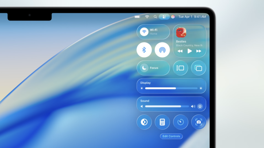
User feedback from those testing the beta suggests that activating the Reduce Transparency feature significantly diminishes the impact of the Liquid Glass aesthetic. An illustrative example can be seen here: prior to enabling this setting, the menu bar seamlessly integrates the colors and images from what lies beneath. However, upon activating Reduce Transparency, the menu bar shifts to a more solid appearance, making text—like artist names—much more legible.
For those who prefer the latter appearance, it’s simple to enable Reduce Transparency during the update process. On iOS and iPadOS, navigate to Settings > Accessibility > Display & Text Size. For macOS, you can locate the feature under System Settings > Accessibility > Display.
Since these operating system updates are in the beta testing phase, the final changes could differ significantly by the time Apple releases them for all users. It’s possible that by then, the Liquid Glass design will have improved readability. In any case, should difficulties persist or preferences against the design remain, utilizing the Reduce Transparency setting should provide a helpful adjustment.