Enhanced Usability in iOS 26: A Focus on Functionality
While attention often gravitates towards the most dazzling features of software updates, the improvements in functionality are what truly deserve recognition. Take iOS 26 for instance. The buzz around Liquid Glass may be loud, but Apple’s strategic relocation of the iPhone’s search bars and control buttons to the bottom of the display is a significant shift that’s not getting the focus it warrants. This simple modification enhances usability across the Settings, Phone, and Messages apps, making everyday tasks more comfortable, especially during FaceTime video calls. Such an adjustment may appear minor, yet it eliminates the need to stretch fingers or grip the device with both hands for routine actions.
A Long-Overdue Change
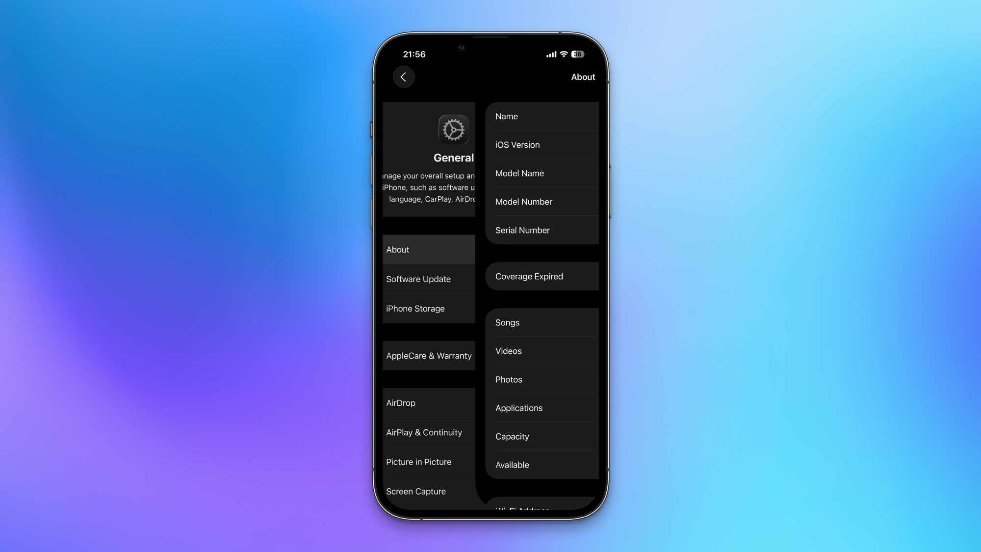
From the very first iPhone model, the 5s, the aim has been to create easier access for thumbs to reach critical apps. In earlier iOS versions, this was a challenge, as customization options for the home screen were minimal. Efforts were made to arrange favorite apps in an inverted L formation at the bottom-right corner for one-handed access, but options remained restricted. Presently, app icons can be positioned virtually anywhere on the home screen, along with customization options for the Control Center, yet there remained a need for advancements.
For instance, meticulous planning often gets sidelined once an app launches. Many applications adopted Apple’s previous design, positioning search bars at the top of the screen, where they are not easily reachable. While some third-party applications have opted to place their Create/Compose buttons at the lower right corner, Apple’s native apps have lagged in ergonomic considerations, establishing an unfavorable pattern. This may not have been an issue with the compact iPhone 5s, but since transitioning to a larger Pro Max model, it has become crucial. Thankfully, iOS 26 has finally tackled this concern.
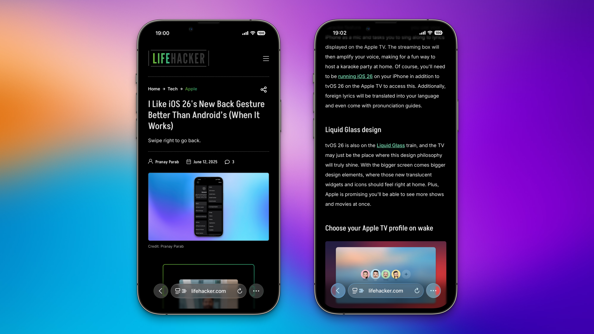
Improved Back Gesture
For right-handed users, the back gesture in earlier iOS versions has been less than ideal, necessitating a stretch to the left edge of the screen to swipe right. With iOS 26, many of Apple’s applications now allow a more convenient method of returning by swiping right from anywhere on the display. This change is significantly more user-friendly.
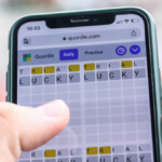
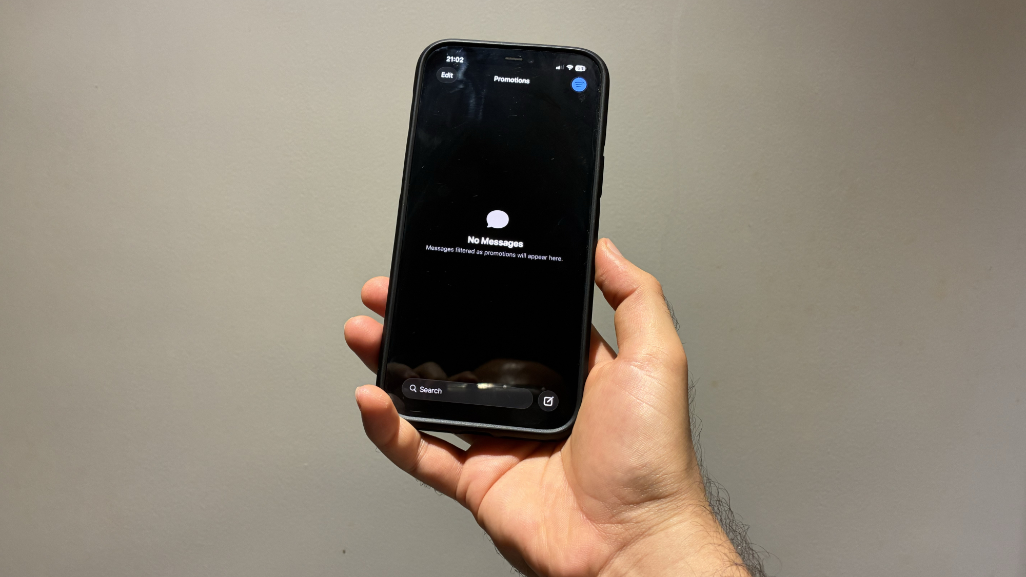
Accessible Search Bars
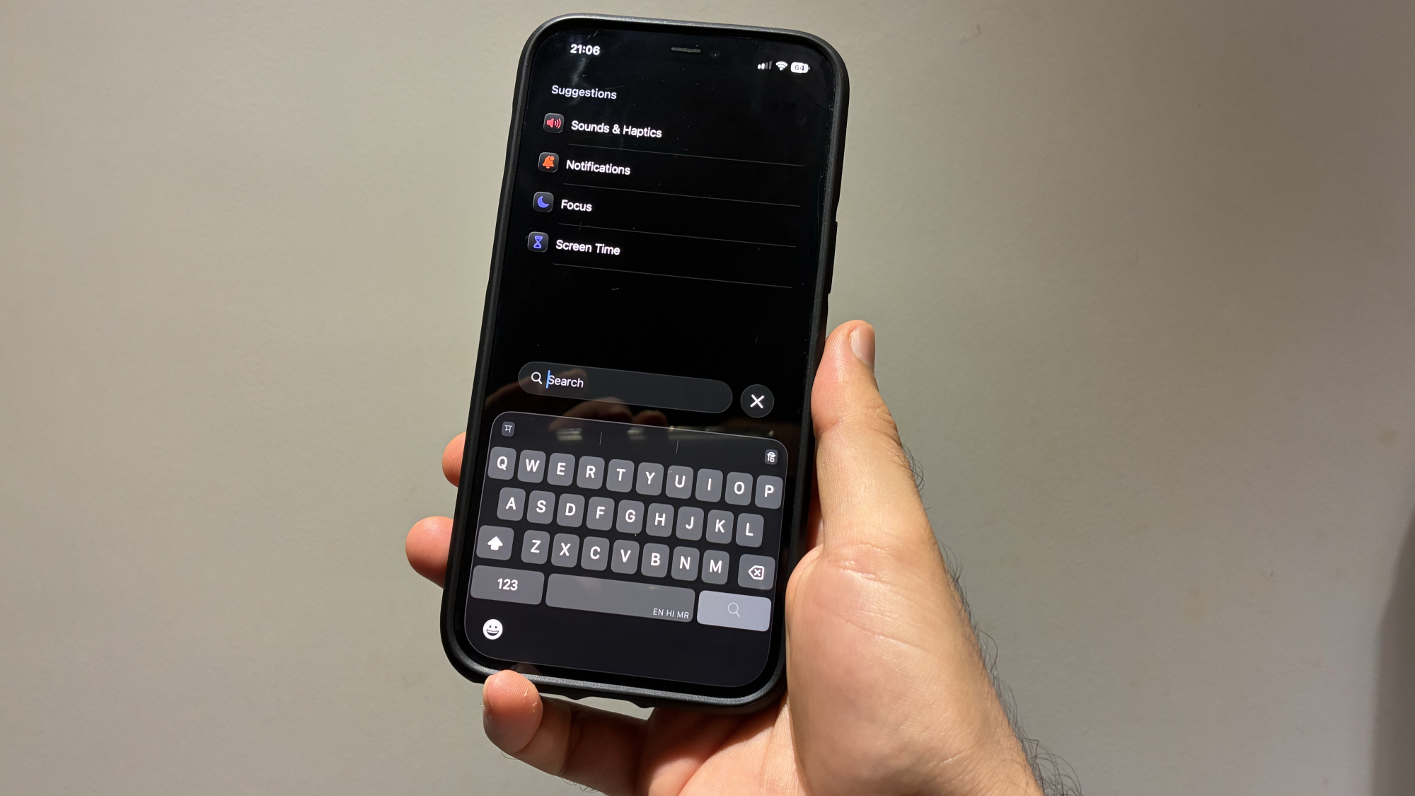
Opening the Mail, Messages, Notes, Podcasts, Phone, or Settings apps in iOS 26 brings a notable enhancement. The search feature has conveniently moved closer to the bottom of the screen. For frequent users of the search function in these apps, this adjustment greatly reduces the effort required to access it.
Optimized Compose Button Placement
Many applications include a button for creating new content—whether it’s a file, an email, or a chat. In iOS 26, Apple has successfully repositioned this vital button to the lower-right corner of the interface. This includes the Create Reminder button in Reminders, the Compose Email button in Mail, and the New Message button in Messages. At last, Apple is aligning with the ergonomic standards set by third-party applications.
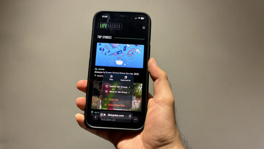
Safari’s Compact Layout Boosts Ergonomics
Though Safari had earlier relocated its address bar to the bottom of the screen, the iOS 26 version introduces a new Compact layout for even more ergonomic use. Users can now grab the address bar and swipe up to copy URLs, making this process far simpler than navigating through the Share option. Additionally, double-tapping the three-dots icon allows for efficient bookmarking. However, it’s essential for Apple to ensure that the Share and Tabs buttons remain easily accessible in future updates, as they are currently hidden behind the three-dots icon, which is not ideal.
To revert to a more familiar layout, navigate to Settings > Apps > Safari, then scroll to Tabs and select Bottom.
FaceTime’s New Video Call Controls: A Major Upgrade
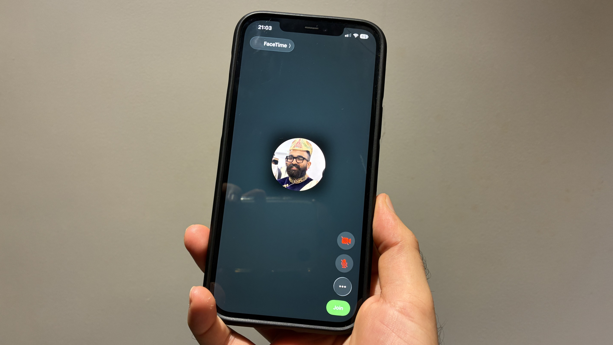
FaceTime used to have its call controls positioned at the top of the screen, which has now been restructured in iOS 26. The controls are now conveniently located near the bottom-right corner of the screen, simplifying actions like muting, disabling the camera, switching audio devices, or ending the call.